Who could guess the unexpected result on the final decision?
After the initial logo scrapped last year over allegations of plagiarism, The Tokyo Organizing Committee finally unveiled the new logo from four finalists on the public competition.
Checkered pattern, nominated as design A, won easily
The winning logo, by Japanese designer Asao Tokoro, is entitled Harmonized Checkered Emblem which features three varieties of indigo blue rectangular shapes to represent different countries, cultures and ways of thinking.
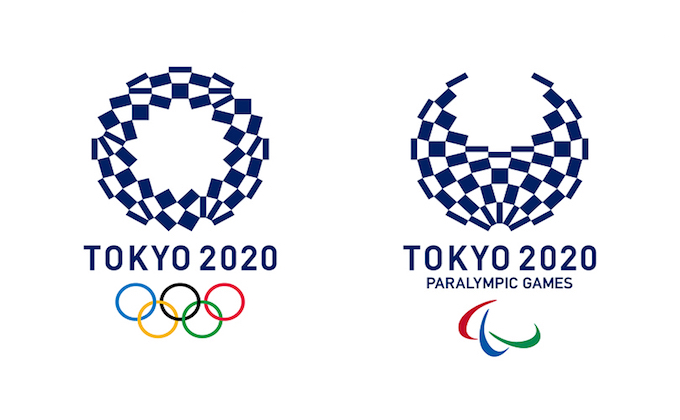
This kind of geometric logo might look a bit simple and something like unsatisfied design for overseas.
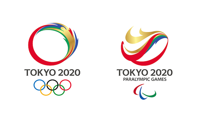
Actually, the result of prior questionnaires about four designs at non-Japanese is completely opposite to the Tokyo’s decision.
But this is the Japaneseness as well, and we hope that people all over the world could accept this traditional logo to unite for the world competition in 4 years.
Thanks a lot for reading to the end.
