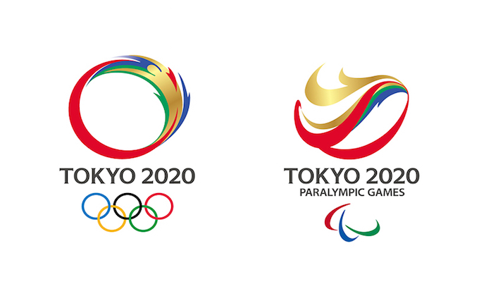
First of all, we do appreciate that many overseas participated in questionnaires about emblem designs of Tokyo 2020 Olympics through Google+ Page, and you’re here to see the quite interesting result.
Before the final decision released on April 25, 2016 officially, we’re able to see various opinions from the world, not only Japanese ones.
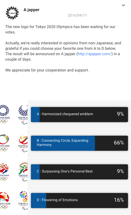
Design B, Connecting Circle, Expanding Harmony, on 4 final candidates got about 65% of the total votes
As you can see the result below, design B won by a large margin above the second D, and A is virtually the same as C at the bottom.
Interestingly, the Another Questionnaire we asked on Google+ shows almost the same result.
From the point of Japanese view, we think that the checkered design of design A in the traditional Japanese color of indigo blue expresses a refined elegance and sophistication that exemplifies Japan.
If you’d like to compare with 4 final candidates by big photos, please refer to our previous article.
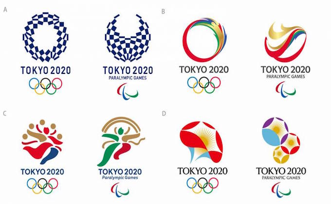
Anyway, The Tokyo Organizing Committee still welcomes your comments on the Opinion Form for the final decision, and we hope we could choose proper one for the world competition.
Thanks a lot for reading to the end.
