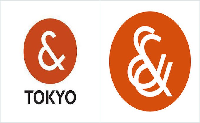
Anybody apparently has the same though after comparing with these logos.
A few days ago, Tokyo Metropolitan Government officially announced the new logo for Tokyo 2020 Olympics, but it already got controversial again.
The new logo is too similar to have a word of coincidence
The right logo belongs to “Plug & See” which is a French glasses bland, and you can see how similar it is.
If there is a terrible plagiarism again like the previous scrap, Tokyo Metropolitan Government has to change something from the bottom.
https://ajapper.com/tokyo-2020-olympics-logo-suspected-of-plagiarism
The total production cost was about 1,000,000 dollars
All of the money came from taxes paid by residents in Tokyo, and they’re wondering why the cost was so high.
It also became a trigger of anger while having sense of distrust against Tokyo Metropolitan Government.
How about taking like a public vote before having the final decision of the logo?
People are fed up with a kind of copy, and would like to see definitely original one.


